


Updated: Sep 30, 2020
Authors: Are Haartveit, Harald Husum and Tom Van de Wiele with equal contributions.
Continuation of Part 1: COVID-19 projections.
DISCLAIMER: The modeling effort described in this article aimed to predict the first wave of COVID-19 related deaths and is not updated since May 3, 2020. The graphs and explanatory text will not be updated.
In this part of the blog post we dig deeper into the data sources that were used for our analysis. We also describe our interactive data plots and explain how we make predictions for the evolution of the pandemic in each of the studied countries.
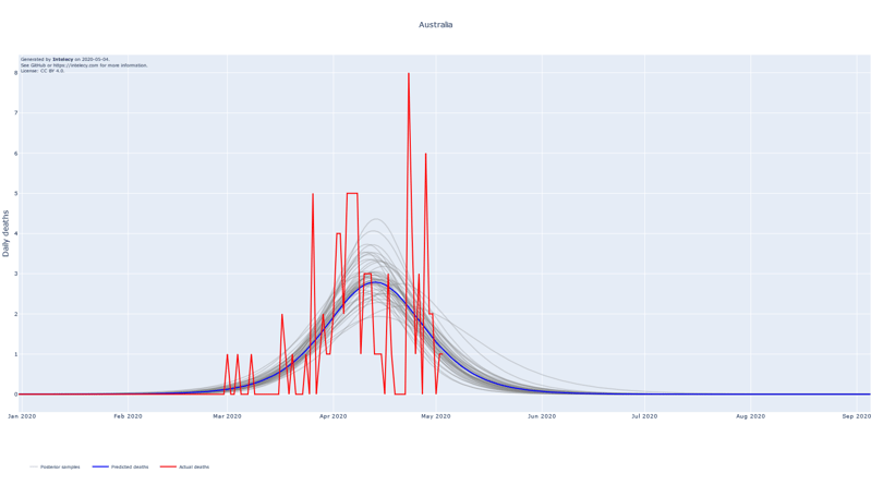
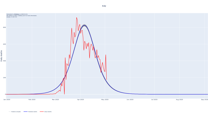
A sneak peek of the daily death forecasts can be found below. It seems like many of the worst affected European countries such as Spain, Italy, Belgium and France are near or past their respective peaks of daily deaths. The predictions for countries that are in a relatively early stage of the epidemic, such as Australia, India and Indonesia, are subject to high variance.

Sources:
Data sources
For population data, we use the United Nation’s probabilistic estimates for 2020. These are not the most accurate or up-to-date data for any given country, but were easy to combine with our other datasets. They are certainly accurate enough for the purposes covered in this investigation.
Interactive plots
When attempting to gain knowledge from data, a good initial step is to perform some kind of exploratory data analysis. In our case, due to the wide interest in the spread of SARS-CoV-2, there are already a lot of good graphical representations of our data out there. Consider for instance the Johns Hopkins interactive case tracking map. We focus on graphical representations that are not as readily available, or that we find particularly interesting.
One feature we felt was lacking in a lot of visualizations is the ability to easily compare countries. It is desirable to be able to know which country is an infection hotspot at any moment in time. Our first plot shows us that the US has surpassed Italy as the global epicenter of confirmed new infections (as of March 22).

The similar plot for deaths indicates that the US has recently become the global epicenter of deaths due to COVID-19 (as of April 1).

The countries in these plots are all at different stages of the epidemic. In order to better compare the trajectories that different countries follow, it can be useful to offset the starting point of each country, so that the relative stages of the epidemic align. We assume that countries that are now at the start of their trajectories will roughly follow the patterns observed in countries that have already seen widespread infection. Given this assumption, plots with some kind of common anchor point can help us form some rough prognosis for how the epidemic might develop in countries who are currently seeing the start of their outbreak. We see that there is quite a bit of variability in the development of both deaths and cases across countries. We can see that, for now, Spain and South Korea represent the pessimistic and optimistic outliers in terms of how the death count can develop.
 Absolute numbers of both confirmed cases and fatalities are really only comparable between countries in the early stages of an epidemic. Given similar responses to the epidemic in countries of different size, we expect the amplitude of their graphs to be proportional to the total population. In order to account for this we also plot population relative numbers. The plots that are scaled by population show less variability than the absolute value plots, and might thus give us clearer prognosis for countries.

From a population relative perspective it is obvious how effective China has been at stopping their epidemic. Likewise, it is clear that Spain is going down a trajectory that is more severe than the Italian one. We can also see that Belgium is doing the worst at the time of this writing (April 15). An important side note here is that there is more variation for countries with less inhabitants.
Modelling approach
In our attempt to model the future of the outbreak, we decided to focus on the number of reported deaths. The number of reported deaths due to COVID-19 is likely to be approximately accurate and therefore comparable between countries.
The number of confirmed cases, however, suffers from under reporting, availability of sufficient tests and variability of testing procedures. As the epidemic progresses, countries tend to switch from following up close contacts of confirmed cases in combination with extensive testing to focusing on the most urgent cases, resulting in more cases not being confirmed due to the absence or mildness of disease symptoms. As a result, there is significant noise in the timing and total count of confirmed cases, leading to large differences between countries in terms of the estimates for the proportion of symptomatic cases reported.
As opposed to the number of confirmed cases, the number of deaths also seems more clinically relevant as it can serve as a proxy for the load on the healthcare system in a country.
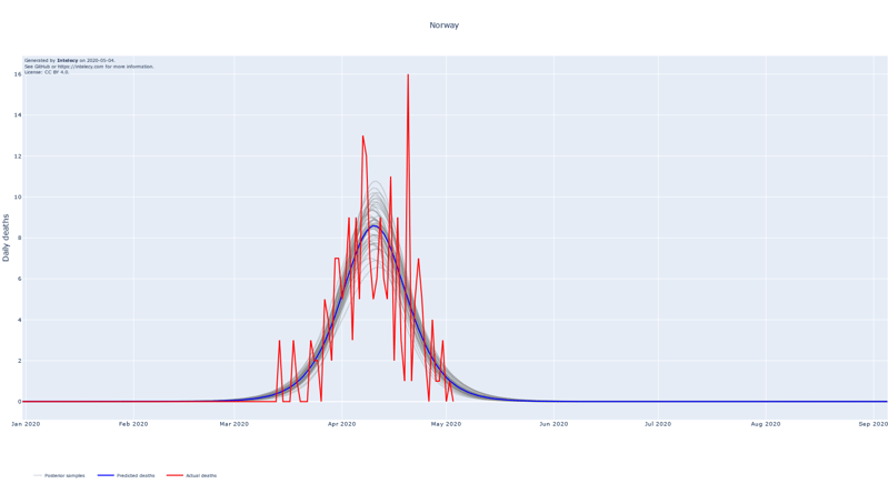
The graphical model in our forecasts is intentionally kept simple in order to avoid overfitting and maximize interpretability. Every country is modeled independently, and we only make use of the daily deaths data.
We assume that the number of deaths follows a logistic curve. This function is used to model growth in a constrained environment, where the growth rate will reach a peak, then start to slow down. It is commonly used in biology to model population growth and also appears to be a good fit for the projected number of deaths due to COVID-19.
We define three parameters to describe the derivative of the logistic curve: the central time (halfway point of maximum daily deaths), the peak number of daily deaths and the width of the curve. Given the estimated number of daily deaths on the logistic curve, we assume that the number of reported deaths follows a Poisson distribution.
To estimate the posterior distribution of the parameters for our graphical models, we make use of the Python package PyMC3. The PyMC3 package focuses on advanced Markov chain Monte Carlo and variational fitting algorithms to perform probabilistic inference. We use the standard inference settings and show forecast plots for the mean posterior parameters, together with 100 random samples from the posterior distribution. This combines a “best guess” of the evolution of the epidemic, combined with a degree of uncertainty of the model fit.
The choice of the prior distribution has an important impact on the posterior distribution in cases like this where there is limited data. We decide to select uninformed priors but want to stress that the choice still has a considerable impact on the posterior distributions.
We assume a uniform prior for the central time of the logistic curve in the period between December 31, 2019 (epidemic start date) and the epidemic start date plus twice the number of days between today and the epidemic start date.
As for the width constant of the logistic curve, we decide on a uniform prior between 3 and 15, meaning that 90 % of deaths occur in a window of 9 to 44 days.
Interpretation of the forecasts
The forecasts show the logistic curve that is the best fit to the observed data. The best fit is defined as the logistic curve with the mean of the posterior parameters for the central time, peak and width. We also show 100 random samples from the posterior distribution to get an estimate of the uncertainty of the best fit.
The assumption of using the logistic curve proves to be a good fit for countries where the peak of the number of deaths seems to be in the past. Examples of this are China, Iran (to a lesser extent) and South Korea which, at least partly, justifies the choice for the logistic curve.


When summing up the daily deaths we obtain the following cumulative forecasts:
How to interact with our analysis
Our plots are built with the Python library plotly. It is an interactive plotting library that builds on Dash and allows for natural interaction with the data.


